Retirement Planning App • Case Study
Currensee

Project Overview
Background
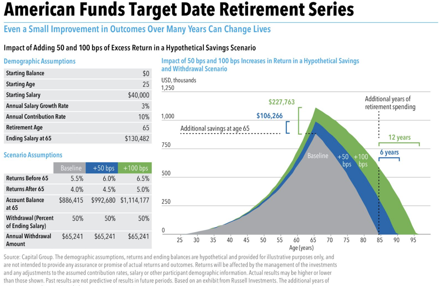
ABC Capital’s American Funds Target Date Retirement Series is a savings plan designed to build and preserve wealth. They need an easy to use mobile app design.
Challenge
Design a mobile app interaction that ABC Capital’s clients can use to visualize the dramatic outcomes that can result from slight changes in financial investment.
Design
Delivered a mobile app called Currensee, a sales app for ABC Capital's sales reps to attract new investment clients through a vibrant and easy to use design.
Deliverables
Secondary Research
User Personas & Flow
Sketches & Wireframes
Clickable Prototypes
Style Guide
Project Info
Design Team: Just Me
Timeline: 48 hours
Project Type: Mobile Application
Tools: Pen + Paper, Marvel, Figma
Research & Synthesis
Current graph presents too much information at once.
Does not allow the user to see personalized data, only hypotheticals.
Is not immediately or easily understandable without prior knowledge of finance terminology.
Heuristic Evaluation
Secondary Research
Millennials face the most uncertainty in terms of their future finances. Many millennials believe that they will be able to survive off of far less money than anticipated, especially because of continuing inflation in the US. Surprisingly, 66% of millennials have nothing saved for retirement. This led me to focus the design of Currensee on this Millennial group, as they are a large up and coming market to appeal to. Millennials live in the age of instant gratification, so the app needed to live up to these quick turnaround expectations.
Problem Statement
ABC Capital’s American Funds Target Date Retirement Series is a savings plan designed to build and preserve wealth. They need an easy to use mobile app design.
User Personas
Based upon key research discoveries, I developed two user personas; Sarah Sales and her potential client, Michelle Millennial.


Design Framework
Redefined Problem Statement
ABC Capital needs an app that allows sales reps to get potential clients excited about the possibilities for their retirement savings. The current model does not allow Sarah to instantly and easily show potential clients customized data. How might I design a sales app that helps Sarah to attract new clients by immediately and attractively visualizing outcomes from slight changes in their retirement planning journey?
Research Driven Design Objectives
Users want the flexibility to see the impact of their choices and to weigh their options
Users expect instant results and the ability to update variables in real time for a personalized experience
Users need an easy to use app that uses dollars, not basis points to understand how to use their money wisely
User Flow
I began the design process by mapping out Michelle Millennial’s app experience to better visualize and evaluate the steps she needs to take in order to achieve her goals of learning about her future financial plans in a way that is easy to understand. Since Michelle Millennial will be using this app when speaking with Sarah Sales in real time, I decided to make account creation an option after viewing her plan.

Design Ideation
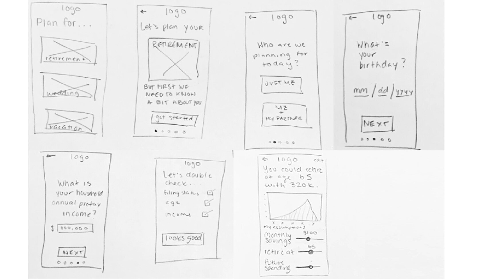
Sketching the User Journey
Through this paper prototype I explored how I could improve the issue of having too much information shown at once on the original graph. I decided to create a multi step input process that has one question per screen so that users don’t feel overwhelmed when using the app. I tested the paper prototype using marvel to gain user insights.
Insights: Users did not like the idea of using sliders on the dashboard screen.
Mid-fidelity Wireframes

Welcome Screen
Insight: Copy needs to be improved.

Filing Status Screen
Insight: Text alignment needs to be revisited.

Confirmation Screen
Insight: Button should indicate what step will happen next.

Retirement Plan Dashboard
Insight: Create second dash screen to show customization.
Mid-fi “A-HA” Moment
Through testing the Mid-Fi prototype I discovered that I was missing the instant gratification factor that users were looking for. I had created one screen for the dashboard, and needed to add another to demonstrate the ability to change variables and see new results in real time. Moving onto the Hi-Fi I added an additional dashboard screen to demonstrate the ability to customize data points.
Design Deliverables
Hi-fi Designs
Stepping into the high fidelity mockup, I added branding and took action on the insights I gained from testing the Mid-Fi prototype. During this phase I realized that I needed to add a screen to show the source data and I also needed to add a profile icon for returning users to access their account as soon as they open the app.

Welcome Screen
Improved copy and added account profile icon.

Filing Status Screen
Changed all text to be center aligned.

Confirmation Screen
Changed button copy to indicate what the next screen is.
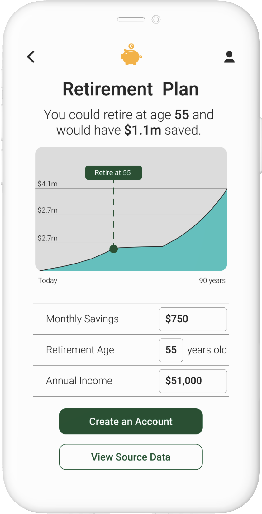
Dashboard 1
Improved copy and added create account button.

Dashboard 2
Created this screen to show variation in data.

Source Data Modal
Added source data modal, one of Sarah Sales needs.

Style Guide
I designed a simple style guide for the Currensee app. I chose vibrant colors to attract millennial users (including millennial pink) in combination with a clean sans-serif font and black and white colors to provide a minimal yet friendly design. Many financial apps can look pretty serious, so I wanted to create an app that is inviting to users. I chose to use green and yellow more heavily as they are the colors you’d think of when you think of money. I created a piggy bank logo to indicate that Currensee is a saving app with a fun vibe.
Hi-fi Walkthrough
Currensee allows users to have a seamless experience by delivering:
An easy to use app that uses dollars, not basis points to clearly understand how to use their money wisely.
The flexibility for users to see the impact of their choices and to weigh their options through variable changes in the dashboard.
Instant visual results when variables are changed and allowing users to update variables in real time for a personalized experience.
-
Next Steps
Conduct usability test on Hi-Fi prototype for branding.
Explore the idea of also making this an iPad app - this could fit Sarah Sales’ needs more effectively.
Design the create account option.
-
Lessons Learned
This was my first project that I worked on by myself under a 48 hour timeframe. I definitely learned a lot about autonomous time management and how to quickly make decisions myself to keep the project moving forward in a timely manner. It was a lot of fun to dig into the problem and develop a unique design solution that fit both of the types of users’ needs.