Guest Experience App • UX Research & Design • Android App
LeiaGuest

Project Overview
Background
LeiaGuest elevates the hotel guest experience by leveraging Leia’s proprietary 3D content. As a sales driven initiative, the goal of LeiaGuest is to provide the client (boutique hotels) with the ability to upsell items and increase in-app conversion rates.
Challenge
Identify competitors, define market opportunities, and establish a flexible design language that suits a wide range of potential customers as well as the needs of stakeholders.
Design
Conducted UX & market research to support the viability of my design concept. Worked with key stakeholders to create an initial design for their proof of concept app.
Deliverables
Competitive Analysis
Client Analysis
Moodboard + Brand Direction
Home Screen Design
Project Info
My Role: Lead UX Designer
Timeline: 4 Weeks
Project Type: Android App
Tools: Figma, Jira, Confluence
Research & Synthesis

Competitive Analysis
Working with the product manager, we defined a list of five guest experience (GX) apps that we would focus on for secondary competitive research by looking at the most competitive apps in the GX space according to Hotel Tech Report.
The purpose of this competitive analysis is to identify key features and design patterns in order to define the GX Home Screen design.
Guiding Questions:
What features are competitors heavily advertising?
How is the UI structured?
Card Sorting
After collecting claims, quotes, categories, and features from competitor’s websites, I conducted independent open card sorts to synthesize the initial data.
I then asked testers to participate in a closed card sort to synthesize initial findings by Persona (Hotel or Guest) only. This helped me define the key features that competitors heavily advertise.
Type: Open and Closed Card Sort
Participants: Four (randomly selected)
Insights: Testers were commonly sorting cards by Persona (Hotel or Guest), Product Feature, or Category of Product Feature.
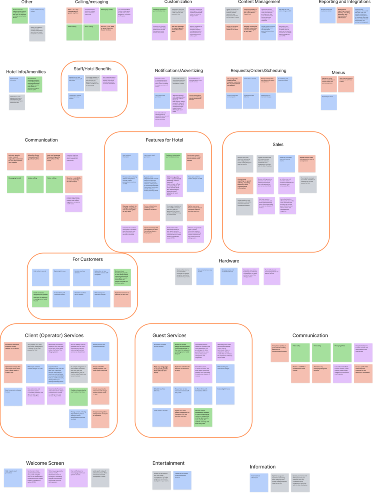
First Round: Synthesized Open Card Sort

Second Round: Synthesized Open Card Sort
Define Key Features
I defined these key features to answer our initial research question: What features are competitors heavily advertising? We also wanted to make sure that we were designing a product that can be sold and competitive in the current market.
Digital Menu
Amenities/Hotel Info
Content Management
Customization of branding
In-app calling and messaging
Revenue generation (Via notifications, upselling, advertizing)
Place requests/orders
Scheduling and event
Collected samples of competitors UI to analyze the layout of home screens amongst successful players in the guest experience app landscape.


UI Competitive Analysis
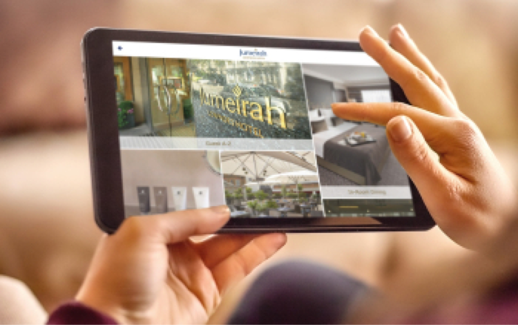
-
UI Layout Patterns
Analyzed competitors UI to establish layout patterns. Layouts were varied and did not follow a particular structure aside from many having card-based content. Since the goal of LeiaGuest was to upsell I decided to move forward with a 2/3 image, 1/3 informational layout. This allowed us to have a large piece of Home Screen real estate to showcase 3D content on 2/3 on the screen. The 1/3 info panel allows users to have quick access to actions they want to perform quickly.

-
Navigation Placement Patterns
We decided to move forward with a top docked navigation bar. This was the most common UI pattern amongst competitors. It keeps the app structure flat and allows users to have quick access to all sections of the app without having to search. It also allows users to easily navigate between sections from any page in the app.

-
Templated Design
We looked at MGM Casinos for inspiration on how to use a single template that is flexible enough to accommodate different hotels’ branding, assets, and varying amounts of copy. We learned that the layouts stay the same but the main changes are using different logos and the brand’s accompanying accent color.

Brand Analysis
Summary
LeiaGuest needed branding different from the Leia Inc. brand guidelines in order to stand on it’s own, look, and feel like a product that would be shown in a luxury hotel room.
Gathered brand inspiration by looking at 5 potential clients’ websites.
Created Moodboard based on look and feel of potential clients branding.
Created Color scheme based on Moodboard.
Looked to MGM resorts for inspiration on templated design that would account for customization of:
- Logo
- Brand accent color
- Image Assets & Copy


Design Ideation
Mid-fi Wireframes

Iteration 1
Created a wireframe using the 2/3 image 1/3 info layout with top navigation as decided in the research/analysis.
Included features as defined by the PRD (product requirements document) in the info panel.
Tested using icons for action buttons in the info panel.

Iteration 2
Added padding around overlay, top nav, bottom bar, guest info, wifi) to create more white space.
Anchored image overlay to bottom of image to make covered space more predictable in the templated design.
Removed icons from quick actions and info panel to simplify overall design.
Hi-fi Mockups
In this iteration I added branding to start to evaluate look and feel. Tested serif and sans serif font pairings with varying weights to create hierarchy and give an elegant feel. Stakeholders selected Option 2 (Playfair Display & Poppins).

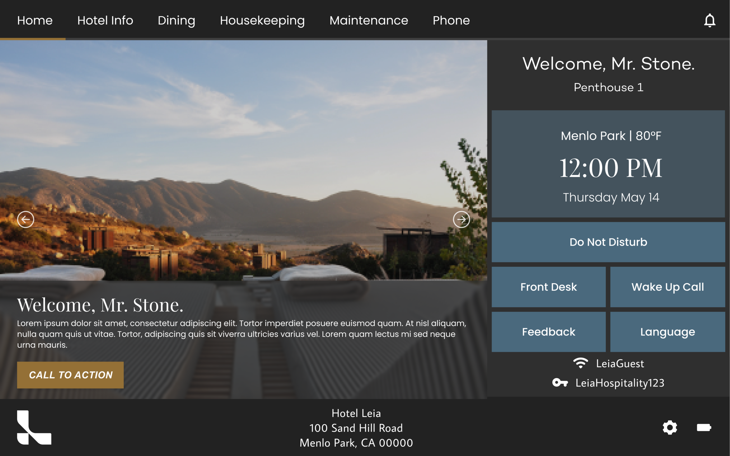
Option 1
Option 2
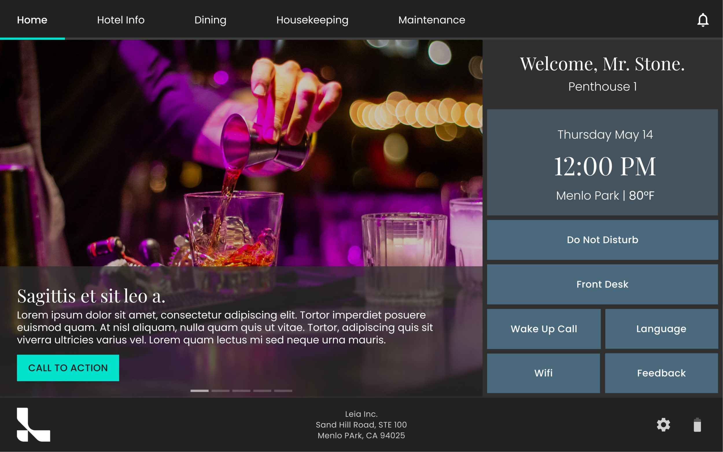
Design Deliverables
-

Templated Customization • Elements & Assets
The templated customization of the design includes flexibility for brands through editable elements in the image carousel, bottom bar. These elements include: Accent Color, Image Assets, Copy & CTA, Logo.
-

Navigation & Bottom Bar
Navigation design was specified through competitive research. It gives users quick access to all app features and includes space for future PRD items to be added. Notifications are prioritized for quick acknowledgement by user.
Bottom bar contains the logo and hotel info, both are customizable by the client. It also provides quick access to general settings, as well as displayes battery life (important when users take tablet out of dock). -

Info Panel & Quick Actions
Info Panel creates a personalized user experience with guest name, room number, date, time, location, & weather.
The quick action buttons give the user the ability to easily access common actions: DND (Do Not Disturb), Front Desk (Chat), Wake Up Call, Language, Wifi, & Feedback.
Templated Customization Examples
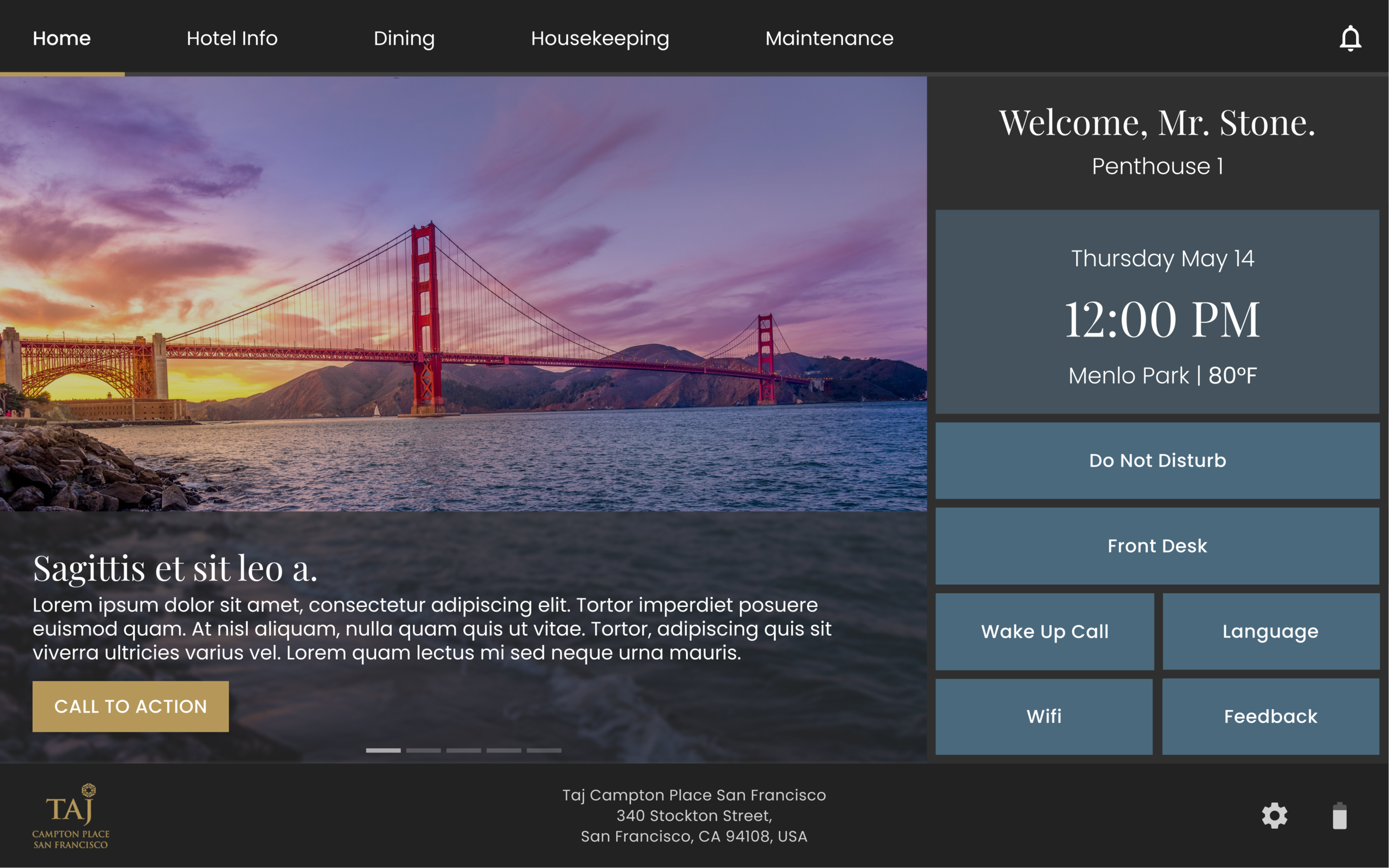

-
Next Steps
Deliver home screen specs to FE developers
Collaborate with FE devs on templated customization implementation
Create design for in-room dining menu that leverages 3D content to upsell menu items
-
Impact
Through this exploration, I was able to prove the importance of UX and market research within the company to stakeholders. Establishing a design process at Leia that values and includes research was an ongoing goal of mine. I also created a base design to bring a new Leia product to the market that could bring the Lume Pad to the hospitality market.